
Scribe Platform Redesign
DESCRIPTION
Desktop tool for an interactive PropTech software used to sketch property and share with others to explore and edit - online, immersively, in 3D.
ROLE
Product Designer | Researcher
UX Design, Visual Design, User Research, Prototyping, User Testing
6 week timeline
PROBLEM
User < > Business Objectives
Scribe needed a platform redesign that addressed concerns provided by existing users and the Apex team - respectively, the overall usability of the sketching tool and increasing the number of token credits sold to users. The challenge was understanding what areas of the tool to focus usability improvement on and how to directly tie those efforts into increasing token sales. We also wanted to focus on a rebranding initiative that would allow the tool to properly match the existing Apex brand.
CONSTRAINTS AND CONSIDERATIONS
-
The Scribe tool runs on a Unity server which controls half the functions within the tool while the rest is run on the web.
-
Our client believed design changes made to Unity functions would be too large for our timeframe.
SOLUTION
Prioritize learnability. This means delivering contextual and visual consistency and a reliable experience while creating a clear brand identity.
Rebranding
Apply consistent design themes between Apex and their product


Menu Organization
Organize similar groups of icons together

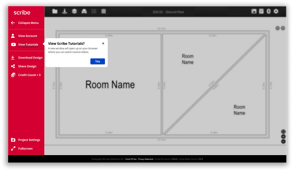
Modal Redesign
Keep users within the experience with unobtrusive popups
PERSONAS
The Average Jo-anna
Our team discussed the following with our client to help us narrow down on the "Average Jo-anna" - the Business to Consumer user who prioritizes a budget-friendly, intuitive, and easy to learn program. Joanna and users like her aim to make large changes to properties with low overhead and stay within a small-scale budget.
-
User Pain Points - What have past users had the most trouble with when using the program?
-
Business Goals - What are Scribe's business goals? What is the market we are targeting?
-
Timeline - What can realistically be done within our timeframe that will make the largest impact?
-
Product Goals - What are short/longterm goals for the product?

Veda Gottumukkala is an Austin based Product Designer formerly at Comcast and Starz. Currently looking for new opportunities.
INITIAL USER RESEARCH & CONSTRAINTS
Interviewed 5 users that met similar characteristics of our persona, Joanna, to test usability of Scribe's current product.
RESEARCH QUESTIONS (SUMMARIZED)
-
Thoughts on Home Page?
-
Where would you go on this page to learn some tips and tricks about how to use Scribe?
-
How would you increase your screen to full screen?
-
How would you share this document with others?
-
How many credits does it take to share this document?
-
-
How would you download this document?
-
How many credits does it take to download this document?
-
-
What would you do when you run out of tokens and need more?
-
What pricing plan would you purchase to be able to share and download a second project?
-
-
Where would you go to update your account information?
COMPETITIVE ANALYSIS


JOURNEY MAPPING - DRILLED DOWN
Not your typical Journey Map
I wanted to create a drilled down visualization where we could study what Joanna's pain points and opportunities may be within the Scribe product based on the user test results. My goal was to understand what broader areas of the process were acting as bottlenecks or were encompassing usability issues the users were experiencing.

MAIN INSIGHT
When asking users to complete tasks, we found the majority of errors occurred in icon recognition and overall navigation. The test results, Scribe's business goals, competitor analysis, and our map caused us to narrow our scope to Menu and Modal redesign within Web.
VISUALIZATION + IDEATION
Creating a Flowchart and Lo-fidelity wireframes
We created this end to end flowchart that Joanna would be following from entering the website to exporting her designs.

Users like Joanna want to be able to quickly learn new software while putting in minimal effort. To design for minimal effort is to design for efficiency, speed, and intuition. We aimed to prioritize consistent design and provide as few distractions to the users as possible while they're in their sessions within the program.

Lo-Fi Sketches
DESIGN IMPROVEMENTS
Based on our first round of usability testing and competitor analysis we conducted, we made the following improvements:
Improving Composition & Layout (Before)

The initial program lacks compositional flow and forces the user's eye to dart across the page towards all 4 corners without rhyme or reason. This exessive cognitive load contributed to the users' difficulty in navigating the page and completing tasks.
USER RESEARCH - PART 2
I tested the same 5 users on our redesign and saw the following test results:
Initial Test Results

Redesign Test Results

AN INCREASE IN USABILITY BY 30%
MAIN INSIGHTS
HIGHER VISIBILITY = BETTER USABILITY
We wanted to provide as much context to the users to help them complete their tasks within Scribe as well as increase the number of token credits purchased in the program. This meant distinguishing icons from each other, creating proper labels and tooltips, designing unobtrusive modals, and giving users access to pertinent information all on one screen to help them make better and faster decisions. Higher visibility directly correlates to better usability and an increase in token credit purchases.
THE FINAL PRODUCT
STYLE GUIDE

SO WHAT DID I LEARN & NEXT STEPS
Good Design is Good Business
It's always an exciting challenge balancing user and business objectives but what I've come to realize is, in the words of Laura Klein, "It’s a mistake to think about business objectives and user objectives in antagonistic terms." The way to achieve business goals is to make those goals relevant and easy for the users to achieve...often cultivating a symbiosis between both parties.
For next steps, I would want to place focus on crafting an onboarding experience that could inform potential users about commonly used functions and highlight any new or unique features. By proactively educating users prior to them entering the sketching tool interface, I believe we could potentially see a drastic improvement in usability and usage of all the features and functions Scribe has to offer.
Thanks for sticking around till the end and hope you enjoyed this case study. If you have comments, feedback, or just want to know how the hell to pronounce my last name, feel free to reach out to me at veda.gottumukkala@gmail.com. Cheers!
More Projects

